The story behind my Identity
Over the Summer I had been focusing on my visual Identity. I have been struggling with coming away from my current Visual Identity which is known as Goldxnsoul. The name is very much linked to my childhood experience. Growing up and living with my Mother and Sister in a small house was very difficult at times, living in a small space, always being around each other can be complicated. However, I have to admit that my childhood and this experience had taught me so much.
My mother would always call me the golden child as I was the shy one. In other words out of me and my sister the one who would never misbehave. Being shy and very much keeping myself to myself I was very connected with my interests and myself. I spent a lot of my time listening to music, reading and focusing on my well being in spiritual ways. This is where the second part of my visual identity name.
I really do not want to let go of my current name however, I am looking to discuss this with my studio tutors to see if they feel it will work professional when being a part of the creative industry.
stage | Cv Design Ideas
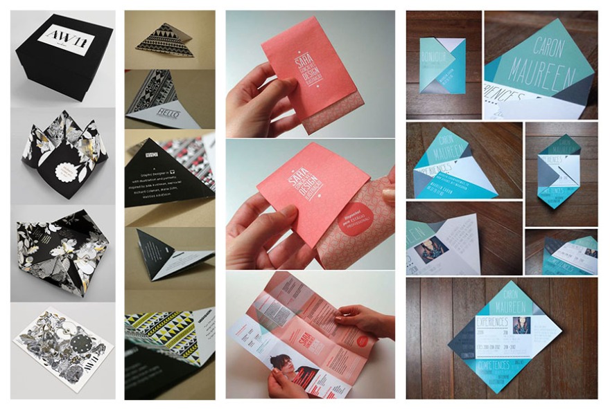
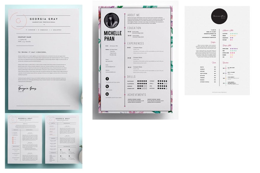
I have been working on creating some layouts for my cv. I want the writing to look organised but displayed in a way where it can be read in a structured order. After researching different layouts of cv’s online previously I had worked freely using different layouts to see which one would work best.
First Cv Layout
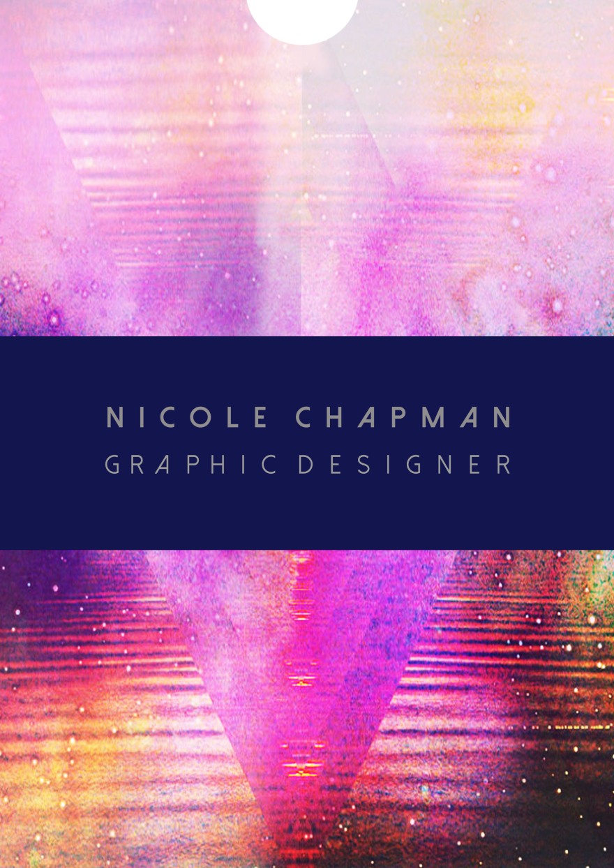
This was my first layout idea using one of my favourite formal typefaces Didot. I feel it is important to use the things that represent you whilst creating your visual identity. I am unsure of sticking to this type face as it may be too formal for my style or expressing myself as an artist. My second attempt was to move the writing to different areas and also change the font to see if another would work better.
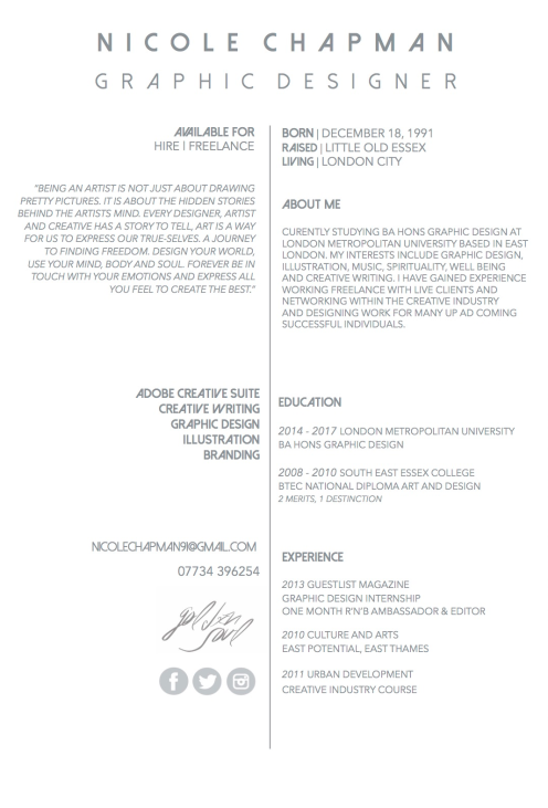
I have experimented with changing the previous font to another of my favourite typefaces called Dolce Vita Heavy & Dolce Vita Light. I also wanted to play around with my layout and the colour of the font to see if a softer tone would work better.
Adding Colour & Design
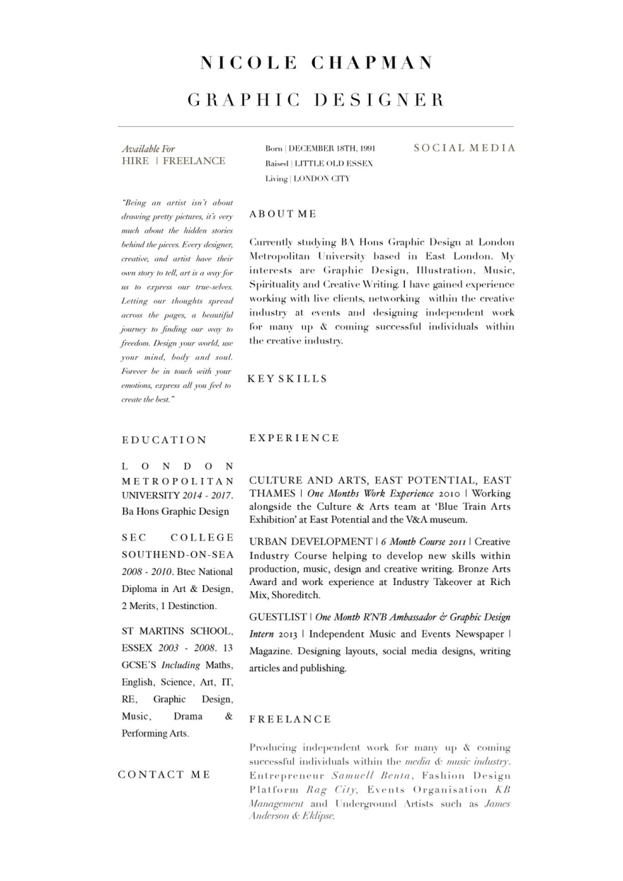
I am an artist who loves colour and the majority of my design work is created using a range of soulful colours and patterns. I have framed the information written on my cv with one of my pattern designs.
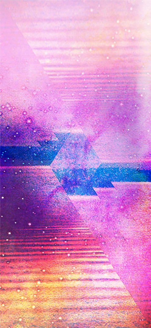
The above image is one of my independent design pieces. I have used a variety colours which I feel are some of my favourite colours, being warming and soulful. I have created two different frames for my Cv which I am thinking of using.
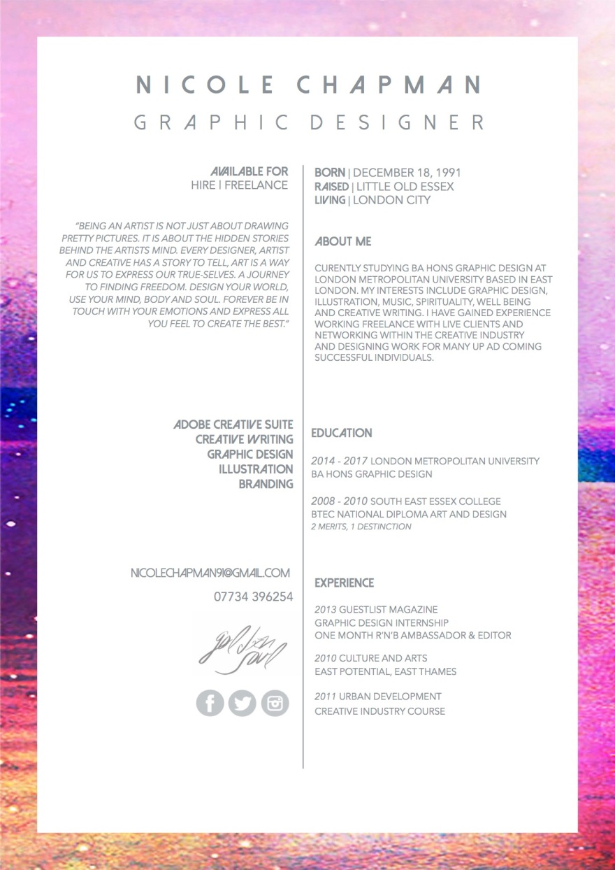
I then placed my information on top of the background I felt worked best for the amount of writing I had included. I feel the background used as frame for the information works well instead of placing the type straight on top of the image as this would make my cv very difficult to read.
Reflection
I am very happy with my first cv design however I would like to experiment with some more backgrounds as well as different ways of framing my information and the fonts used. I may also be changing my logo and identity name however I have not come up with a solid decision as of yet.