Branding | Creating our own visual identity.
This weeks CIP lesson was run by Imminent City Tutor Ricardo Eversley. Taking us on a step by step journey to learning about the essential skills needed to create our own official visual identities.
Why words must be decoded with meaning, when looking at branding which logos are popular for showing their visual identities. Some examples of companies that already do this are; Adidas, Nike, Mc Donald’s.
Books to consider; Designing Brand Identity by Alina Wheeler
Logo Design Love by David Airy
Los Logos by Buro Destruct
Glitch, Family Masks are all important aspects of creating your own potential professional brand.
SHAPE | The Sequence of Cognition, Branding, Identity and Self Promotion. Most logo designers use grids as a clear guideline to help them to design accurately. When most companies start out they usually use type and image as a logo design. In time once people become familiar with the brand they simplify the logo.
Designing branding identity.
Below are some shapes used regularly in this process.
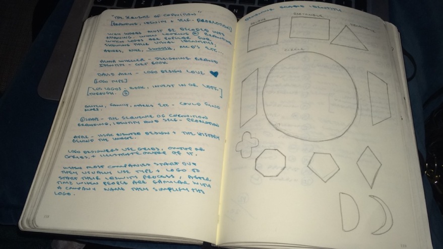
After sketching out these shapes we them moved onto a new exercise a game titled name the logos. Sections of 20 logos were displayed on the screen we had 10 minutes to guess them all. I didn’t do too well only getting 12 out of 20 correct, at least I tried.
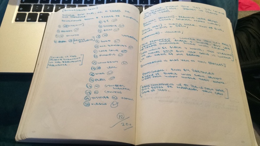
Through out this task we learnt that colour is the second element in the branding sequence. The power within how we use colour is key. Standing in second next to shape. Following this task we then took a look at some well known celebrities and what colours we feel represent them.
Madonna’s being yellow, as she’s a blonde and works perfectly well with her completion.
Steve Jobs being blue and white, two colours used a lot in his portrait images and his design ideas. Adding to Steve Jobs identity would be his turtle neck sweaters.
Michael Jackson’s being black, white and silver, three colours he wears frequently during his shows and to add to his identity his legendary white socks, sparkly gloves and his signature move the moon walk.
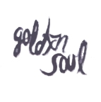
Self Promotion is very much linked to who you are as an individual, your personality. For example I love to wear black, all black everything but my personality is bubbly and fun. Another colour I could chose for myself would be gold as most of my jewellery is gold which I accessories with on a daily basis. This has already helped me with some ideas for my logo designs.
Illustration is also key in this process.
We then were set a task to create visual identities for current brands. Ricardo told us the name and a brief description of the companies and we had to brain storm first and them create finalised quick logos for these companies.
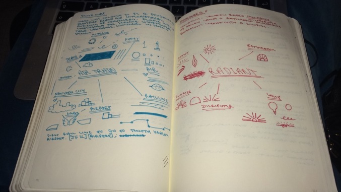
First up was Air Train, created to be a progressive transport brand for international audience of travellers. People would understand the service whatever their language. (Universal in tone and design)
Second was a London based company named Radiant, selling Italian lamps and bathroom accessories. Represents light with a sunrise. My brain storm images are below.
We were then given an A3 grid sheet, to sketch out our 5 best ideas for each logo design. I am pretty pleased with the simplicity within my logos. This lesson has helped massively, I now have a much clearer mind towards creating my own visual identity.