Designing Pantones | Colour Palettes.
This year I have come up with a new, really helpful technique when working on my branding projects, this is an independent task I like to experiment with which I used last term when creating brand concepts. Most designers need to chose the best colours for their design ideas however, having good meaning as to why I have used what colours adds value. Previously, before completing this task I did some research behind the hidden meanings of colours to help me chose the right tones for my cafe concept. I decided on using five different colours which had meanings linked to my vision, mission, profile statement.
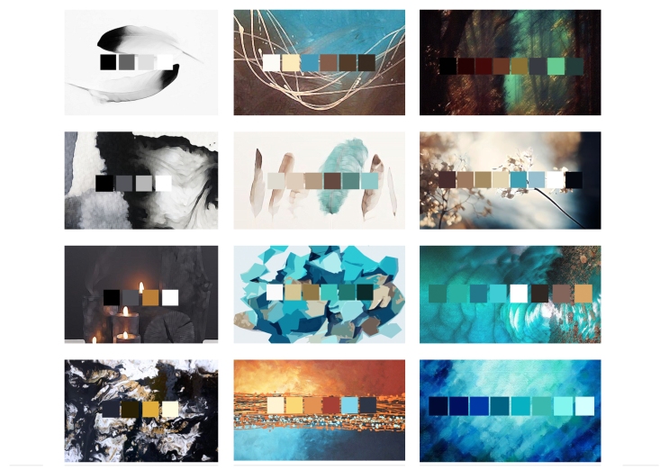
Below are the colour palettes I have created ranging from the simplest combinations to more in-depth ranges of tones using the colours I have chosen for cafe. The light golden brown included in the pantone’s below is supposed to be gold, I had attempted to edit these several times however after saving the files the colours continued to change.
Reflection
I had created the background imagery using different paintbrush tools on Photoshop to add a more creative touch to my colour palettes. Using the colour selection tool I edited the small boxes which sit on top of the images to express the different shades used in the background images. I honestly love designing these it is always a fun activity to complete and also gives me a good insight into how different colours can compliment one another in different ways.
